

Use Case: What Calendar Cohort Revenue Analysis Reveals (That Retention Alone Never Could)
Of all the users who subscribed last summer, how many are still your customers today? And how many of them will renew next month automatically? In this article ,we’ll tell you how to know this and what to do next.

You’re not a data analyst. You’re a founder. Your app’s making $30K/month, maybe a bit more, but margins are tight. You’re testing paywalls, writing onboarding flows at midnight, and obsessing over churn. You already checked ARPU and retention graphs. But sometimes it just feels… flat. You don’t see the money.
Now imagine this:
You open a graph, pick September 2025, and instantly see exactly which user cohorts brought in money that month - and how much. You scroll back and see that your July 2024 cohort still pays 14 months later. Meanwhile, May 2025 looked strong early on, but revenue fell off a cliff. One glance, and you know what’s working, and what’s bleeding you.
This is what segmentation by installation cohort in the Apphud revenue reports gives you - your cash inflow explained. Now you know exactly what worked months ago to deliver money today.
Before we go deeper, let’s take a step back.
In product analytics, a cohort is a group of users who share a common start point. It could be the date of installation, first app launch, or first purchase. In Apphud, we use a precise definition of the First Seen Date, the earliest known user activity, to anchor all cohort analytics.
Traditionally, cohort analysis has been used to track subscription lifecycle: how many users renewed, how many dropped off, how ARPU, APPU, etc. changed over time. These iteration-based cohort reports — like Apphud's classic Cohort Retention charts — are great at showing how value unfolds after acquisition. You can see how many users reached renewal X, what revenue came from each cycle, and how monetization patterns evolve.
But there’s a blind spot: they don’t tell you when your cohorts are delivering cash.
Left-aligned cohort analysis
Classic retention reports group users by the renewal iteration: how many made it to renewal #1, #2, #3, and so on. These reports are incredibly valuable for understanding churn curves and the subscription lifecycle. However, they are disconnected from actual revenue timing.
Why? Because iterations are not aligned to the calendar:
- Different billing cycles of different products: weekly, monthly, and annual. Comparing iteration 1 across them ignores real-world timing.
- Time shifts in renewals. Even for one product, iteration length varies. Due to billing issues (payment failures, recovery retries, grace periods), renewal 2 may happen in 30 days for one user and in 37 days for another.
- Time shifts in start If you build cohorts by installation date (First Seen), you’ll group together users who subscribed on day 1 and those who came back months later after reinstalling. If you build cohorts by first purchase date, you may mix users acquired from completely different campaigns, who installed and reinstalled at different times, and again, due to billing disruptions, even the same iteration might reflect different payment dates.
Retention tells you who stayed, but not when the money came in. Besides, they don’t include non-renewable purchases. This classic left-aligned approach (grouping users by their subscription iteration) is helpful to compare behaviors across cohorts at the same lifecycle stage, but not their timing. It’s like watching everyone’s story start on the same timeline, regardless of when they actually arrived. It’s good for consistency, but it hides time-based cash flow signals.
That’s where calendar-based analysis, or right-aligned cohort analytics, comes in. This approach, popularized in e-commerce and fintech as vintage curves, lets you see exactly when money arrives from each acquisition wave. Think of it as shifting from a user-lifetime view to a calendar view. The difference is subtle but critical: instead of “how long did they stay,” you’re asking “when did they pay?”
It’s available in Apphud’s Revenue reports, with segmentation by Installation (First Seen) Month or Week.
Even better, Apphud blends both views:
- In Subscriber Cohort reports, you can see not only how many users reached a given renewal stage, but also how many from the cohort are still actively subscribed today, and among them, how many have auto-renew enabled.
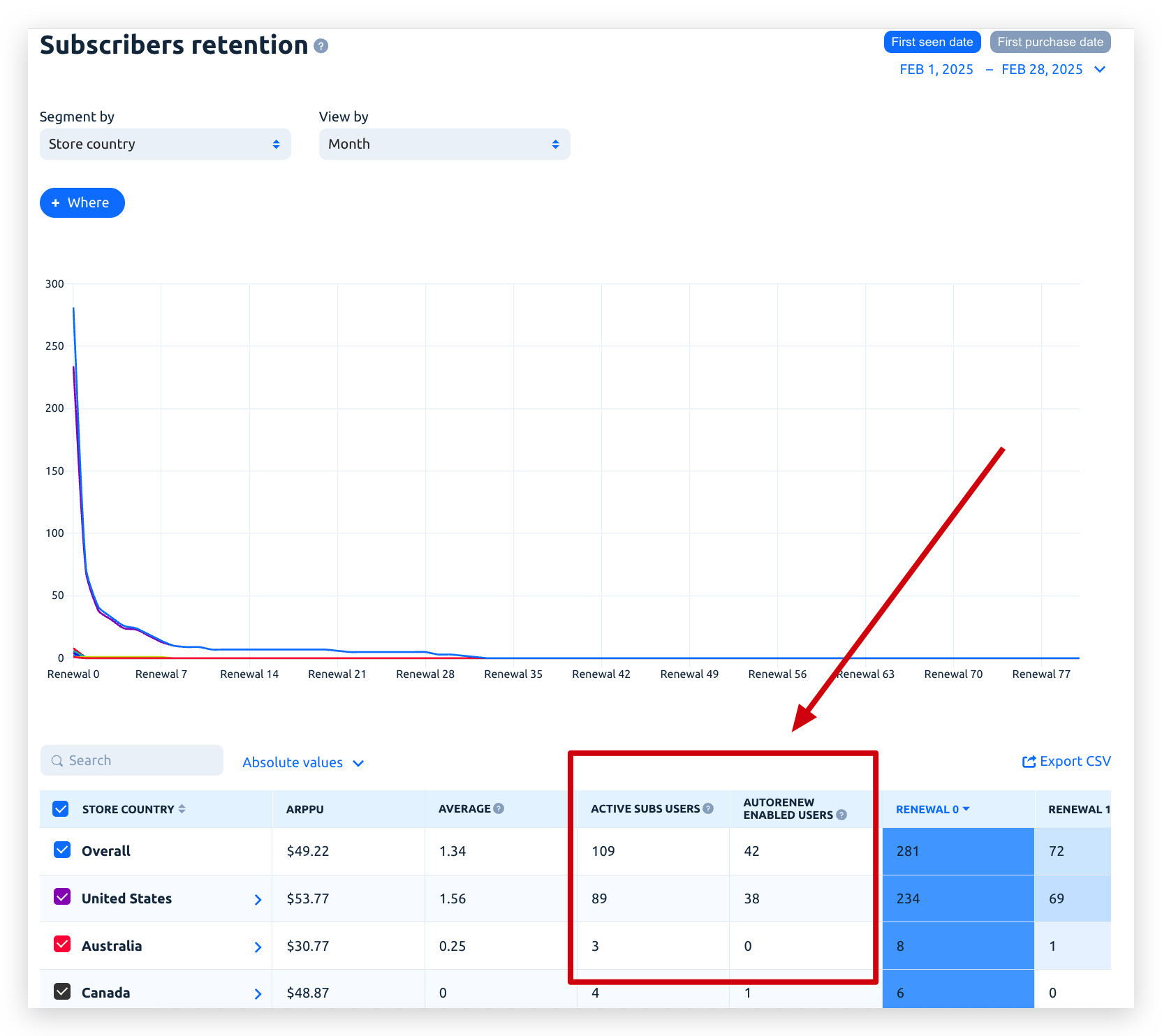 Subscribers Retention Report, Apphud
- In Revenue Reports, you can segment by cohort and see both recurring and one-time purchase behavior over time.
This is especially powerful in mobile apps, where subscription and non-subscription products coexist and understanding who is still paying you (and likely to pay again) is the key to stable growth.
Right-aligned cohort analyses & The Closed Gap
Retention ≠ Revenue Timing — as was explained, classic reports show when users started and how many iterations they stayed. They don’t tell you when the actual money hits your account.
The segmentation of calendar revenue reports in Apphud by Installation Week or Month shows when cohorts paid you.
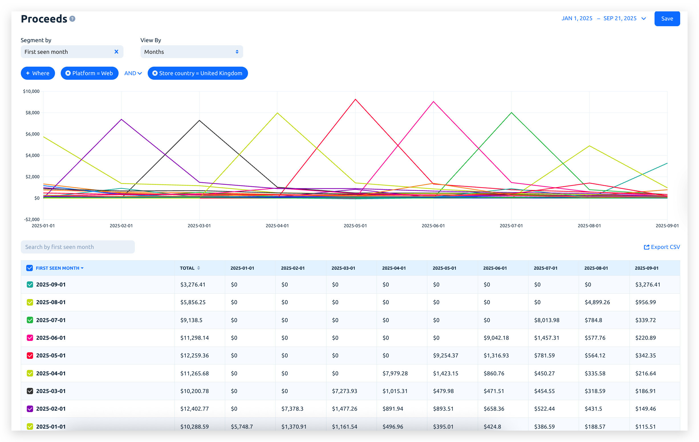 Proceeds Report, Apphud
Now you can track cash flow by calendar timeline and answer questions like: What did March earnings consist of? Who paid me in June? Which cohort kept bringing money?
Reading Between the Lines — Or Rather, the Curves
Sure, the table view of such a report gives you precise numbers — and when it comes to money, accuracy matters. But don’t overlook the power of visual patterns: chart curves can reveal things raw numbers won’t tell you immediately. From delayed monetization to seasonal behavior and billing cadence mismatch — many insights are hiding in plain sight. Below are a few quick hints on how to interpret these cohort curves depending on your product type.
1. The highest peak will almost never be at the cohort’s start date
Especially with trials or billing grace, expect the revenue peak to be shifted right — sometimes by a week or more.
This is totally normal — payments often happen after conversion, not instantly on install.
2. Match your “View By” to your product duration
- View by week for weekly subscriptions and View by month for monthly subscriptions
- For yearly subs, stick to monthly or longer spans
Otherwise, your chart will be noisy or misleading — short-term dips don’t matter for long-cycle products.
3. The smoother the slope, the better the retention
If the curve declines gently, your product has strong renewal flow and fewer dropouts.
Sharp drops after 1–2 periods = front-loaded churn.
4. A curve that rises, dips, and rises again? That’s recoveries at work
That "M" shape likely shows retry billing or grace-period returns.
Especially common in weekly plans — signals cash flow instability.
5. Parallel curves = consistent behavior
If several cohort lines follow the same shape, your funnel is stable. If one cohort looks totally different, investigate it.
Maybe you tested a promo, changed onboarding, or launched a new paywall — and it worked (or didn’t).
6. Filter by acquisition channel or other attribution parameters
Not all users behave the same. Filter by ad campaign, channel, etc.
You’ll likely find that Organic users = longer retention, flatter decay, while Promo-acquired users = higher peak, steeper drop
7. Compare “healthy” vs “risky” cohorts
If one cohort looks spiky and unstable, try to reverse engineer what changed that month.
That’s where product + marketing sync matters most.
Use Cases
Let’s go beyond theory. Here’s how you can use the new report to make sharper, faster decisions.
Use Case #1: Identify Long-Living Revenue Cohorts
What you see in the data:
The July 2024 cohort made $7,149 in its first month. But also: $4,316 in June 2025 - 11 months later!
Why it matters:
Not only did users stay subscribed - they kept paying real money almost a year later. These are gold-tier users.
What you can do:
- Re-engage this segment with tailored offers.
- Clone their journey - same channel, same onboarding, same paywall timing, or if special engagement happened that increased users’ loyalty.
Use Case #2: Spot Staggered Revenue Patterns
What you notice:
There is a cohort with strong early revenue for a weekly product following a recent campaign, but it also has higher billing issues. Still, the retention reports look deceptively stable and quite healthy, showing a decent number of still subscribed users, and those reached multiple renewals.
But when you look at calendar revenue by week, the picture is messier. The revenue is not evenly spaced - it is delayed and drops faster than expected.
Why it matters:
You don’t want to lose weekly cash flow reliability, as it is critical for short-cycle products. Your users may be exploiting the grace period: a big portion of the cohort consistently pays late, not on expected charge dates, but only when premium access is finally cut off.
Users in grace delay revenue, reduce forecasting accuracy, and increase volatility.
What you can do:
- Check pricing expectations - too aggressive? If not, run Experiment offering the same product without grace - will the retention be the same?
- Analyze Billing issue recovery patterns via the advanced Apphud report for Renewal Performance to find a root cause or specific audience.
- Engage with users who encountered a billing issue to recover money early via Apphud Rules.
Use Case #3: Find Refund or Churn Patterns Over Time
You launched a new monetization flow after a two-week test, which proved it to be successful.
What you see two months later:
September’s calendar cohort report shows a big refund spike - most refunds came from users acquired in July.
What you can do:
- Now you have the signal to pause the new monetization schema.
- Consider refining onboarding before the paywall shows up or putting emphasis on better engagement after the first payment.
- Activating Refunds management via Apphud Win Back Refunds feature to ensure that only fair refund requests are accepted.
The Conclusion: Powerful Apphud Analytics to Increase App Revenue
You’re not just building an app. You’re building revenue.
The segmented by Installation cohort view in Apphud Revenue reports turns your calendar into a cash flow map, showing you where money came from, where it’s drying up, and what to do next.
Looking for the next step? In mobile subscriptions, a strong cohort today may bring predictable returns for 6, 9, or even 12+ months. When you combine Apphud’s cohort segmentation with real-time subscriber status and predictive LTV, you get your own version of a vintage curve for app monetization.
Try it now in Apphud and see the patterns behind your earnings.
Need help interpreting your own cohort timeline? Reach out — we love decoding stories behind the numbers.


