

How to Design a High-Converting Subscription App Paywall (with Examples)
In this guide, we’ll break down the essential ingredients of a high-converting app paywall - from how to communicate value to creating irresistible CTAs - all backed by real-world examples and actionable tips.

Introduction: Why Paywall Design Can Make or Break Your Subscription App
In a subscription-based app, the paywall isn’t just a monetization gate - it’s your most important conversion moment. It’s where users decide whether your app is worth their money, time, and commitment. And often, this decision happens in seconds.
A paywall is the screen or flow where users are asked to subscribe, typically after a free trial, feature preview, or onboarding journey. But simply presenting your pricing options isn’t enough - how you design that experience can make a dramatic difference in conversion rates.
Small changes in layout, messaging, or visual hierarchy can lead to massive shifts in revenue. According to industry data, top-performing apps A/B test their paywalls frequently and have seen conversion rate lifts of up to 30–50% through optimized design and copy alone.
Key Elements of a High-Converting Paywall Design
Designing a successful paywall requires more than slapping on a pricing table. It’s about presenting value clearly, building trust quickly, and removing friction from the user’s decision-making process. Here's what separates a high-converting paywall from a mediocre one:
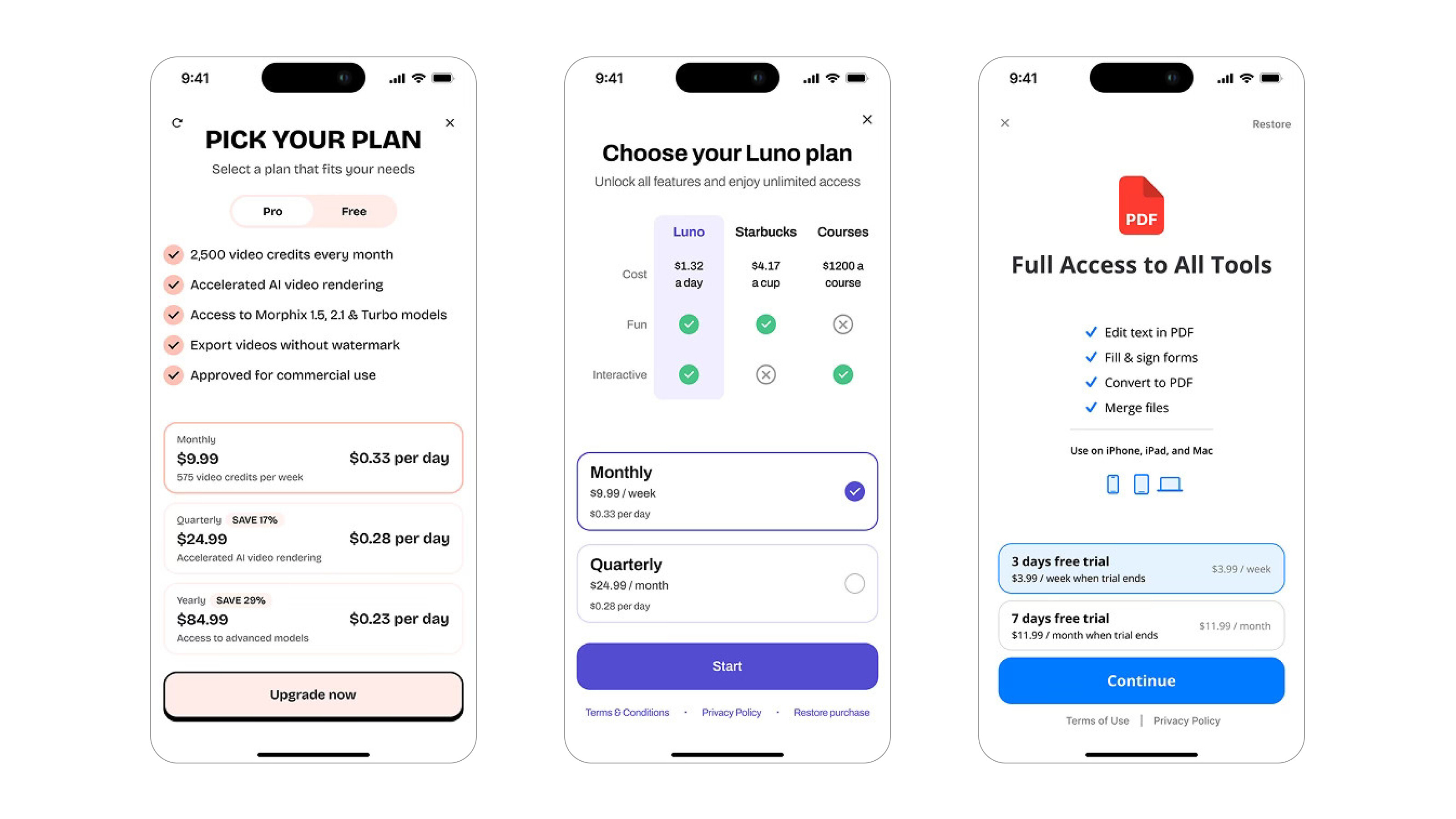
1. Clear and Simple Value Proposition
Before asking users to pay, you need to make it obvious why they should.
- What the user gets: Highlight your core features or outcomes (e.g., “Unlimited workouts,” “Daily personalized meditation,” “Track your habits effortlessly”). Focus on the benefit, not just the feature.
- Concise, benefit-driven copy: Use short, punchy language that quickly communicates value. Avoid technical jargon or cluttered descriptions.
- Social proof and credibility: Awards, app store ratings, “Trusted by 5M+ users” badges, or expert endorsements all help build confidence and reduce hesitation.
Pro Tip: Use the 3-second rule - if a user can’t understand what they’re getting within 3 seconds, your copy is too complex.
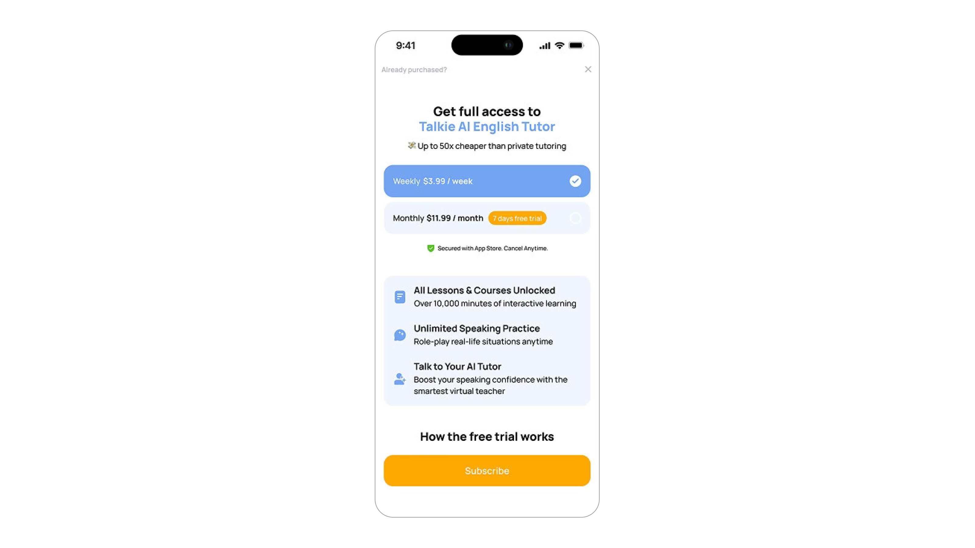
 Paywall examples #1
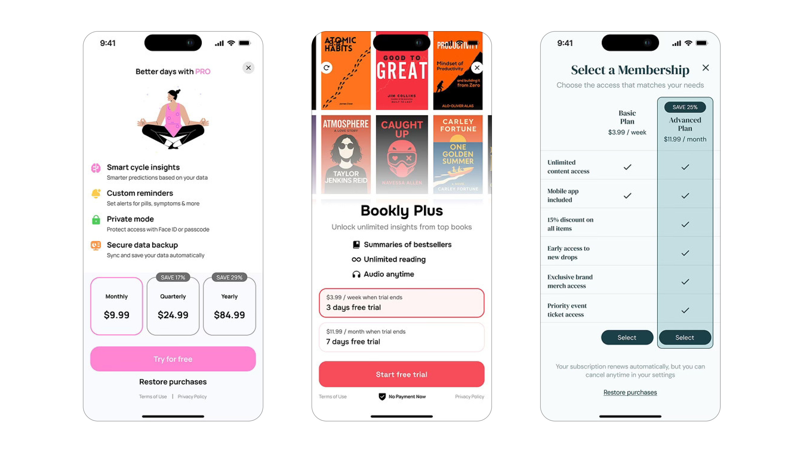
2. Compelling Visual Hierarchy
The structure of your paywall should guide the user’s eye, from understanding value to taking action, without cognitive overload.
- Design and layout: Start with the headline (value), followed by a few visual feature highlights, then pricing, and finally a strong CTA. Use whitespace to prevent clutter.
- Imagery or animation: Product mockups, lifestyle images, or subtle animations can make the offer feel more tangible and engaging. Just make sure visuals support the message, not distract from it.
Pro Tip: Keep important info above the fold. Don’t make users scroll to see pricing or the CTA.
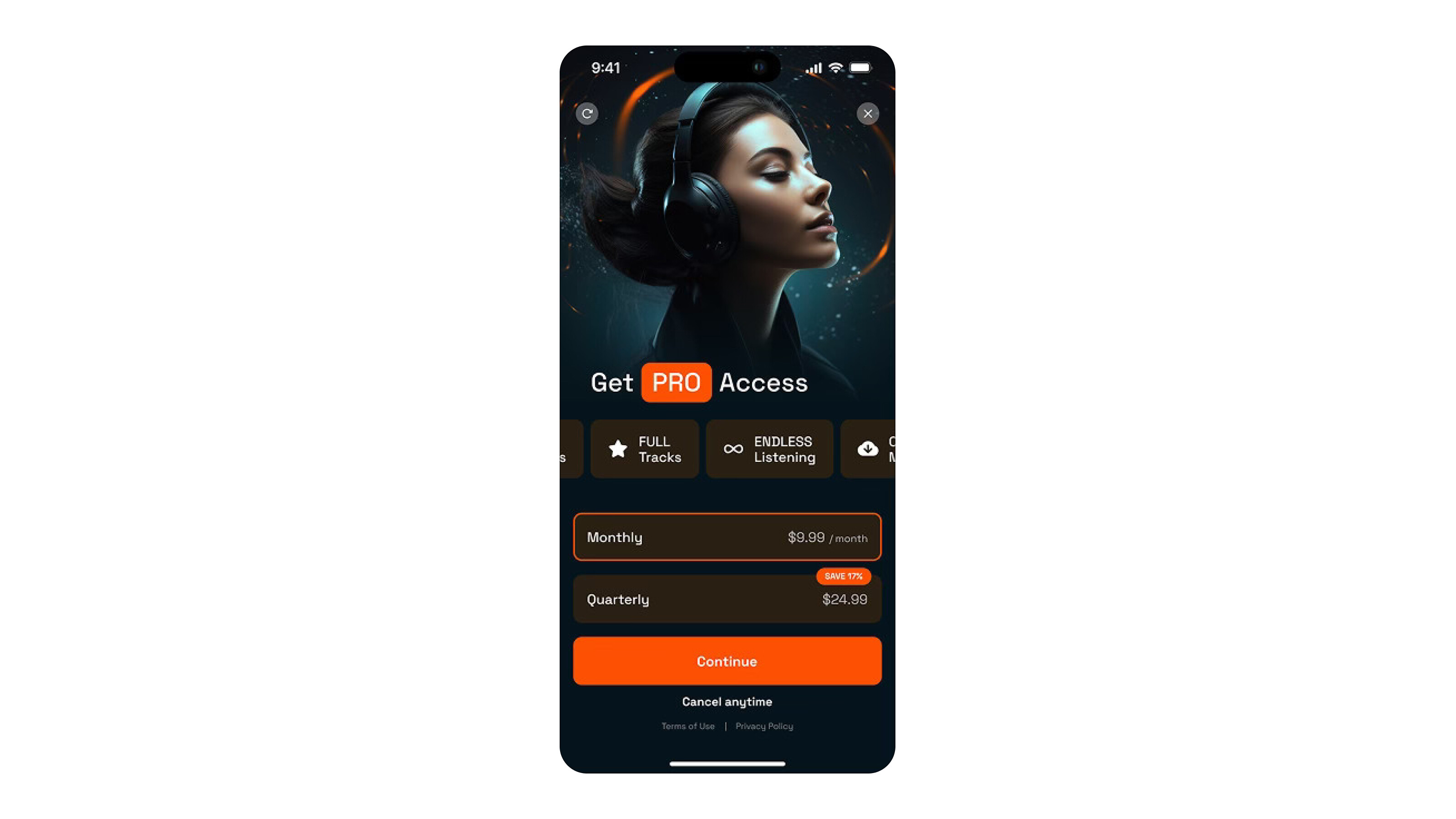
 Paywall examples #2
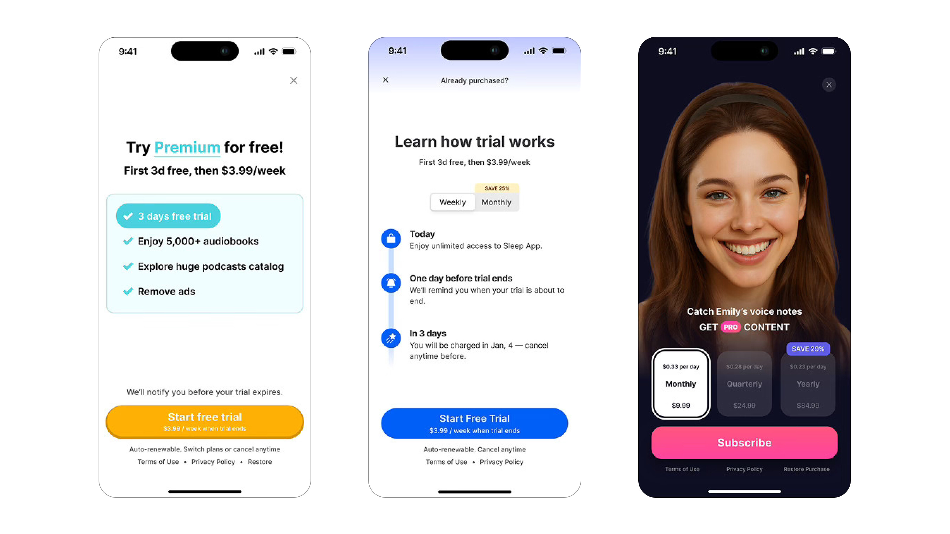
3. Pricing Clarity
Users abandon paywalls when they feel confused or surprised. Transparent pricing builds trust, and trust drives subscriptions.
- Show all pricing options up front: Clearly display monthly, yearly, and trial options without hiding them behind taps or toggles.
- Use anchor pricing and discounts: Highlight the savings for annual plans (e.g., “Save 50%”), and make the recommended plan visually dominant.
- Plan toggles: Let users easily switch between pricing options — and default to the plan that delivers the most value.
Pro Tip: Avoid dark UX patterns like hiding cancellation terms or delaying price reveals — they hurt retention in the long run.
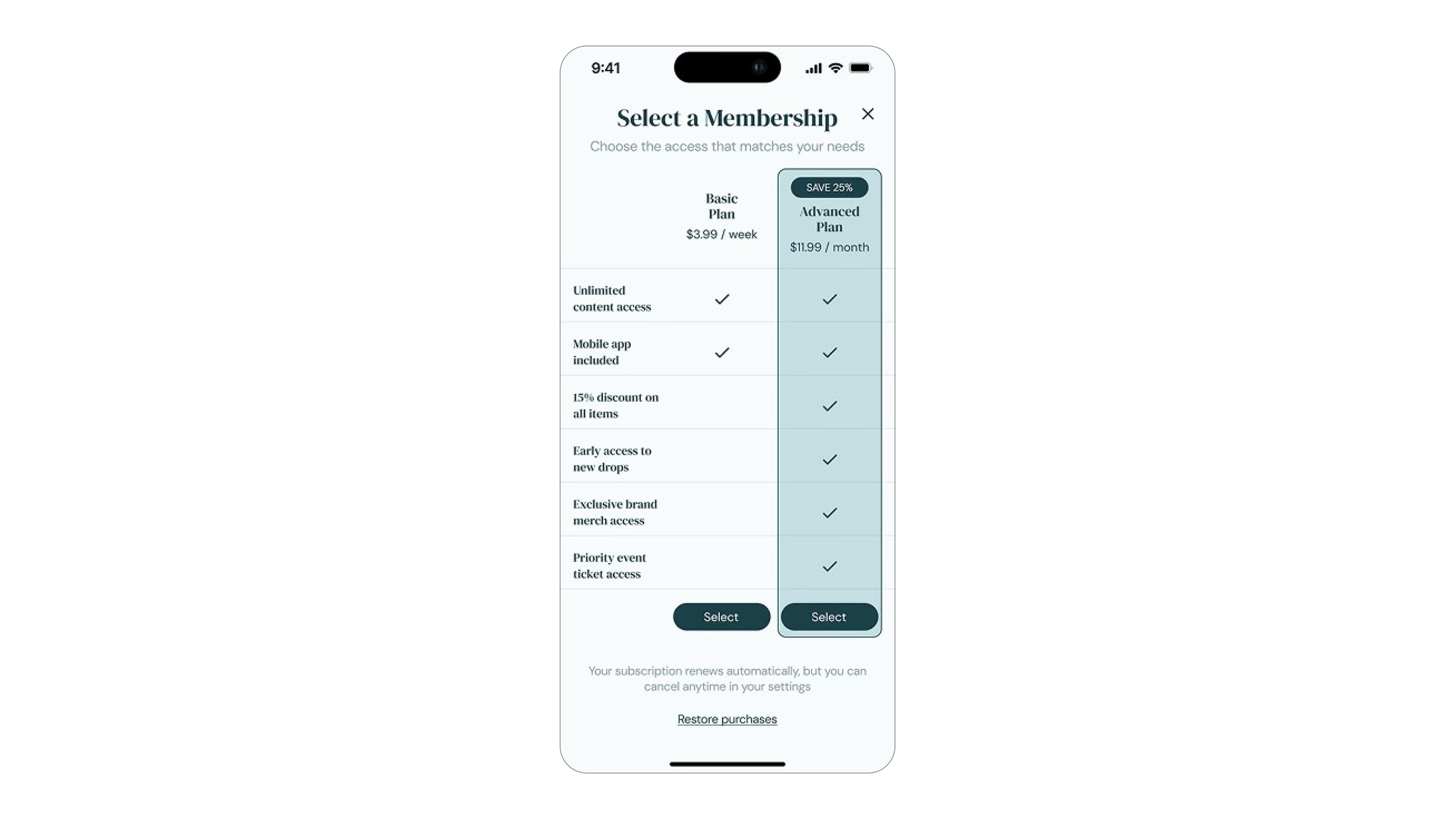
 Paywall examples #3
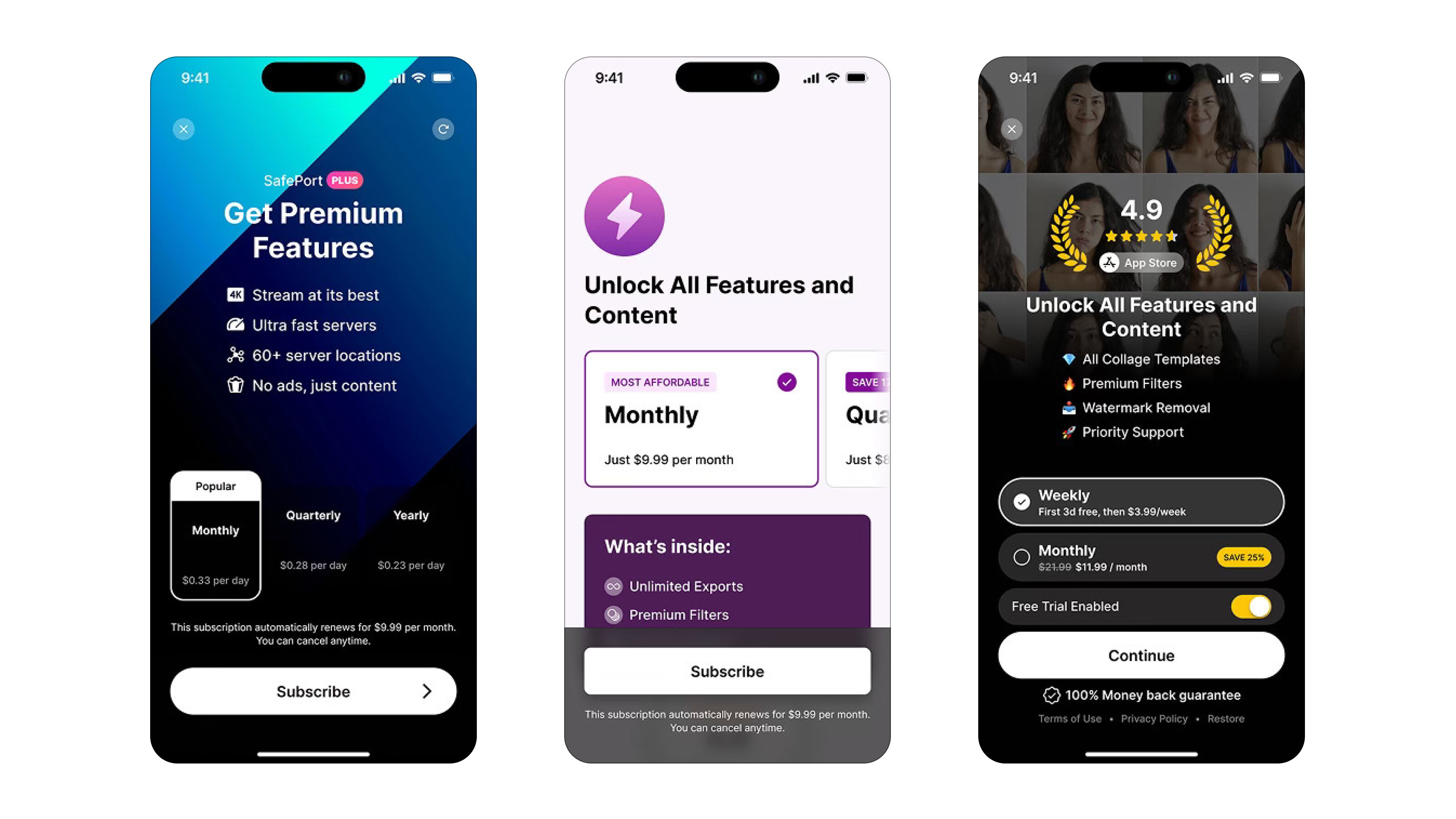
4. Free Trial or Guarantee
Risk is one of the biggest barriers to conversion. Remove it, and you’ll see sign-ups increase.
- Offer a trial: Even a 3-day or 7-day free trial dramatically increases conversion rates by letting users experience value before committing.
- Refund policy or satisfaction guarantee: Make it clear how users can cancel, and reassure them with phrases like “Cancel anytime” or “No commitment.”
Pro Tip: Reinforce the trial as a benefit, not a delay - “Try all premium features free for 7 days” sounds more valuable than “Start 7-day trial.”
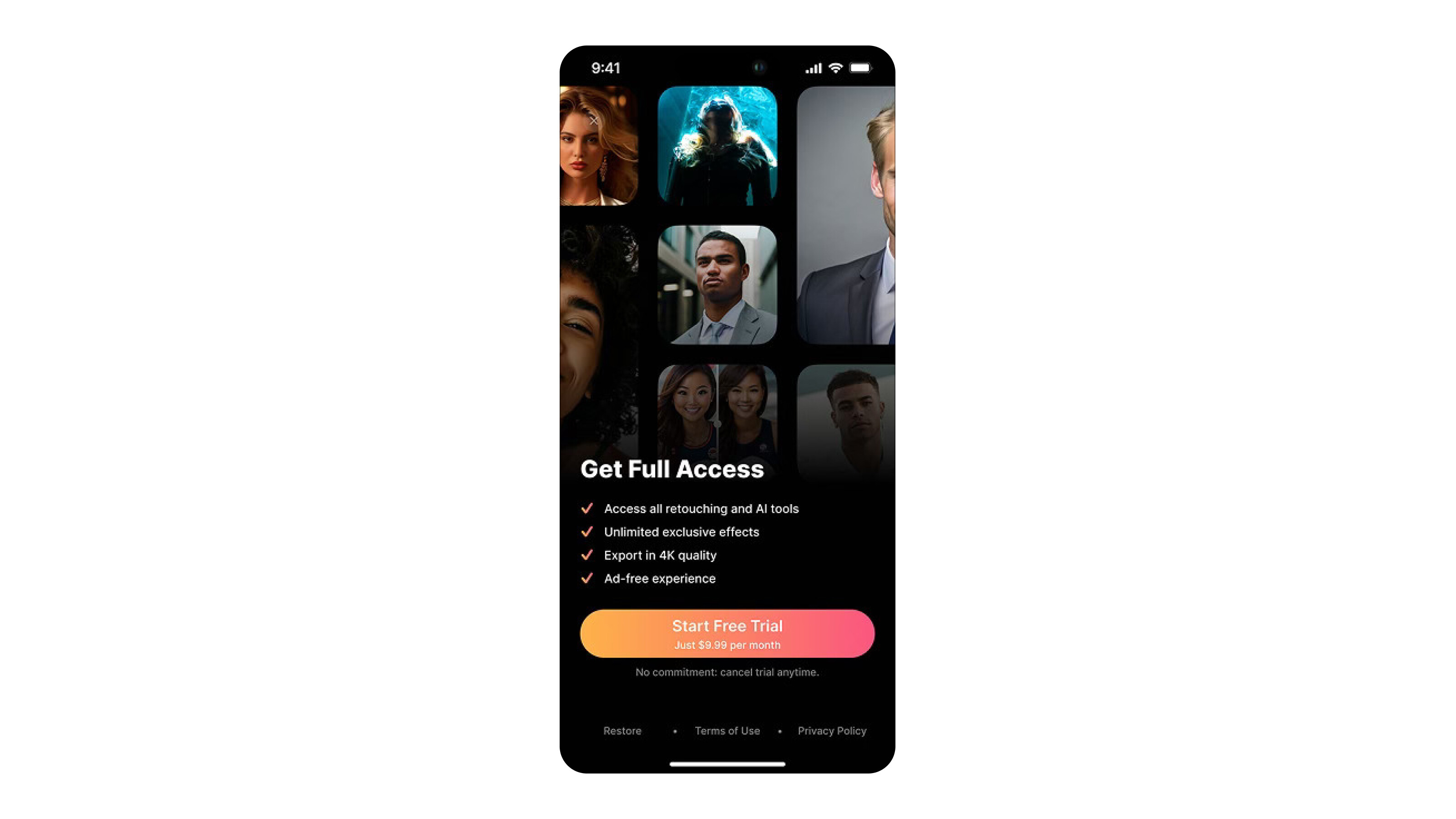
 Paywall examples #4
5. Persuasive CTA Design
The CTA (call-to-action) button is where the conversion happens. Make it impossible to ignore - and hard to resist.
- Button copy: Avoid generic phrases like “Subscribe now.” Use action-driven language that reflects the user’s gain - e.g., “Start My Free Trial,” “Unlock Premium,” or “Continue with Pro.”
- Visual contrast and placement: Use a bold, contrasting color that draws attention. Place the button in a sticky footer or prominent section so it’s always visible when scrolling.
Pro Tip: Test variations of CTA copy regularly - even small wording tweaks can lead to 10–20% conversion lifts.
 Paywall examples #5
Progress‑Based Paywall
 Paywall example #6
✅ What works well:
- Progressive disclosure: Duolingo eases users in with an initial value screen, then shows feature comparisons and trial info before revealing the price, reducing overload and increasing commitment.
- Gamified urgency: It emphasizes streaks and lesson progress to prime users before the paywall.
- Soft pause screens: Reminders about trial duration and benefits reduce anxiety around auto-renewals.
⚠️ What could be optimized:
- Reduce friction: The multiple-tap flow may cause drop-off—adding a summary page could preserve clarity with fewer taps.
- Simplify visuals: Consider tightening copy density on intermediate screens to keep attention focused.
Clear Messaging
 Paywall example #7
✅ What works well:
- Time-themed visuals: Adapts to time-of-day (day/night UI), for subtle personalization.
- Trial transparency: Clearly outlines trial length and billing timeline - eases anxiety.
- Plan nudging: Annual plan is defaulted and positioned prominently as best value.
⚠️ What could be optimized:
- Retention of skippers: The skip button is large; consider retargeting elements for users who bypass initially.
- CTA copy: Testing different phrasing (“Start Free Trial” vs “Get Premium”) could lift conversions.
Feature Comparison Table
 Paywall example #8
✅ What works well:
- Outcome-oriented copy: Opening with projected gains (+37% stronger) sells results.
- Transparent trial usage: E.g., “2 free workouts remaining” shows limited access, increasing urgency.
- Clear pricing: Side-by-side monthly vs annual with “SAVE 50%” highlight nudges users to longer commitments.
⚠️ What could be optimized:
- Feature details: Adding tooltips or icons next to key features could clarify what's included in each tier.
- Dynamic layout: Experiment with highlighting health metrics users care about to personalize the offer.
Story-Driven Onboarding to Paywall
 Paywall example #9
✅ What works well:
- Multi-step onboarding: 30+ screens gather habits info, build emotional investment.
- Personalization & narrative: “Your future self” letters and user-name prompting (“Nicole, this is for you”) create an emotional hook.
- Soft then hard offers: Starts with an unobtrusive trial toggle, then introduces larger offers as trust builds.
⚠️ What could be optimized:
- Clarify billing details: Pricing language can be vague around annual fees vs monthly billing.
- Streamline onboarding: Consider trimming early steps — deep onboarding builds investment, but may risk drop-offs.
Takeaways & Best Practices
- Progressive disclosure: Warm users with value and soft asks before price reveal.
- Personalized visuals & defaults: Use time-based content and smart defaults to influence choices.
- Outcome-focused messaging: Sell results, not features, to make value tangible.
- Deep emotional priming: Use UX storytelling to justify the ask and foster commitment.
Common Paywall Mistakes to Avoid
Designing a paywall is as much about avoiding friction as it is about showcasing value. Many subscription apps unintentionally sabotage their own conversion potential by making UX missteps that confuse, frustrate, or overwhelm users, often at the most critical decision moment.
Below are the most common paywall mistakes that can tank conversion rates, along with examples and suggestions for improvement.
1. Hiding Prices or Being Vague About Billing
The mistake: Some apps delay showing prices until the final step or bury them in small text. Others obfuscate key details like billing frequency (“billed annually” vs “$3.99/month”), creating confusion or sticker shock at the checkout screen.
Why it’s a problem:
Users today are hyper-aware of subscription traps. If pricing isn't crystal clear upfront, users lose trust and either bounce or cancel post-trial.
What to do instead:
- Display all pricing options — monthly, annual, lifetime — with labels like “Best Value” or “Most Popular.”
- Use honest pricing: clearly state “$59.99/year, billed annually” instead of splitting the number to make it look smaller.
- If there’s a free trial, clearly state when billing starts and how to cancel.
2. Overloading Users with Text or Complicated Copy
The mistake: Paywalls that include long-winded explanations, technical jargon, or walls of text overwhelm users and dilute the core message: why this subscription is worth it.
Why it’s a problem:
Cognitive load is the enemy of conversion. Most users skim — if they can’t quickly grasp the offer’s value, they’ll bounce.
What to do instead:
- Use bullet points, icons, or short feature highlights.
- Focus on benefits, not features. (E.g., “Sleep better” > “Daily meditation content.”)
- Keep total text under 100–150 words, ideally less.
- Use social proof (e.g., “Loved by 5M users”) to support credibility concisely.
3. Showing the Paywall Too Early (or Too Late)
The mistake: Apps that show a paywall immediately after install, before the user experiences any value, often see poor conversion. Conversely, waiting too long may miss the window of maximum intent.
Why it’s a problem:
Timing is critical. Users need to understand what they’re getting before being asked to pay, but not after they’ve fully satisfied their curiosity with free content.
What to do instead:
- Use value-first onboarding: let users complete a few core actions before triggering the paywall.
- Introduce the paywall during moments of peak motivation, like when they hit a locked feature or complete a goal.
- Use contextual paywalls (e.g., “Unlock unlimited access,” or “Upgrade to track more habits”) instead of generic “Subscribe now.”
4. Weak or Generic CTA Copy
The mistake: Using default or uninspired call-to-action buttons like “Subscribe,” “Buy now,” or “Continue.”
Why it’s a problem:
CTA buttons are where the conversion happens. Vague or transactional language doesn’t create urgency or emotional engagement.
What to do instead:
- Use action-oriented CTAs that emphasize value or outcomes, like: “Start My Free Trial”“Unlock Unlimited Workouts”“Get Better Sleep Today”
- Match the CTA to user mindset — avoid overly aggressive language for users still exploring the app.
5. Not Testing or Optimizing Regularly
The mistake: Launching a paywall once and never iterating. Many apps treat the paywall as a static screen rather than a dynamic conversion tool.
Why it’s a problem:
What worked a year ago may no longer perform — user expectations, design trends, and competitors evolve rapidly. Small changes can unlock massive growth.
What to do instead:
- Regularly run A/B tests on: CTA copyLayout and plan orderTrial lengthVisuals (static vs animation)
- Use tools like Apphud to measure performance.
- Track conversion rates, trial-to-subscribe ratios, cancellations, and LTV to guide decisions.
Final Tips for Designing Better Paywalls
Paywall design is never one-and-done. It’s a continuous process of refinement - part psychology, part UX, and part data science. Once you’ve established the basics - clear value proposition, strong visuals, and persuasive pricing - the next step is ongoing optimization.
These final tips will help you turn a good paywall into a great one, and ensure it performs across different markets, user types, and platforms.
1. Always Track Key Monetization Metrics
Design decisions should be driven by data, not guesswork. Your paywall may look good, but unless it's converting, it's not doing its job.
Core metrics to monitor:
- CVR (Conversion Rate): Percentage of users who subscribe after seeing the paywall.
- Trial Conversion Rate: Users who start a trial and convert to paid subscribers.
- Churn Rate: How many users cancel their subscriptions - a high churn could indicate misaligned expectations.
- LTV (Lifetime Value): Total revenue generated per user, factoring in retention.
Pro tip:
Segment your data - compare CVR by platform (iOS vs Android), acquisition source (paid vs organic), or geography to uncover optimization opportunities.
Tools to consider:
- Revenue analytics: Apphud, Amplitude
- Experimentation & A/B testing: Apphud, Firebase Remote Config
2. Use Qualitative Feedback to Guide Improvements
Quantitative data tells you what is happening, but qualitative feedback tells you why.
Ways to gather insights:
- In-app surveys after trial cancellation or on paywall exits
- User interviews or recorded sessions via tools like Hotjar, FullStory, or UXCam
- App store reviews — analyze feedback around pricing, paywall surprise, or friction
Key questions to explore:
- “What made you hesitate to subscribe?”
- “What would have made this offer more compelling?”
- “Did anything confuse you about our pricing?”
Pro tip:
Tag feedback thematically (e.g., “trial confusion,” “price too high”) and prioritize improvements based on recurring patterns.
3. Localize for International Audiences
Localization is more than translating words - it’s about cultural adaptation, pricing psychology, and trust signals.
Why it matters:
- Users in different regions have different price sensitivities, language preferences, and UX expectations.
- A paywall that converts in the U.S. may fall flat in Brazil or Japan.
Localization best practices:
- Translate UI copy, pricing labels, and CTA buttons
- Adapt currency and payment methods — show ¥, €, £ instead of USD when relevant
- Adjust imagery or tone to better fit cultural norms (e.g., direct vs subtle language)
Pro tip:
Test region-specific pricing or trial lengths - Apple and Google allow custom offers per market.
4. Optimize for Apple and Google Paywall Compliance
Failing to meet App Store and Play Store guidelines doesn’t just risk rejection - it can lead to removal from the app stores entirely.
Key requirements (as of 2025):
- Transparent pricing and terms: Clearly state billing frequency, free trial duration, and what happens after the trial ends.Use Apple’s required subscription disclosure labels (e.g., “$9.99/year, auto-renews”).
- No deceptive UX: Don’t hide skip buttons or use “dark patterns” to force sign-ups.Avoid pre-checked options or misleading default settings.
- Respect the cancellation flow: Provide easy access to subscription settings and cancellation policies.
Pro tip:
Check compliance with the latest App Store Review Guidelines and Google Play Policy Center before launching a new paywall test.
Conclusion: Good Paywalls Are Built, Not Just Designed
A high-performing paywall isn’t just the result of good design - it’s the product of deep user understanding, relentless testing, and thoughtful UX decisions that support your business model.
From clear value messaging and transparent pricing to strong CTAs and strategic timing, every element on your paywall should work together to build trust and motivate action. But even the best-designed paywalls require continuous iteration. User expectations evolve, competitive standards rise, and what works today may underperform tomorrow.
The apps seeing the most growth aren’t the ones that set their paywalls and forget them - they’re the ones that treat them as living conversion tools, optimizing based on data, feedback, and context.
Want to see more examples or benchmark your paywall?
👉 Download our free Paywall Inspiration Guide to start experimenting smarter.
Try out our paywall builder to implement all your paywall ideas into live in just a few clicks!


